The biggest (and most expensive) glow up at SLOHS. Photo courtesy of sophomore Aidan Field. When did San Luis Obispo High School get so pretty? All embedded photos courtesy of senior Cassiopeia Mamaradlo.
San Luis Obispo High School has gone through many transformations and renovations over the decades. Some years were haunted by displeasing to the eye and ear construction. However, this year, SLOHS has especially bloomed into a beautiful, modernized campus that feels organized and extravagant.
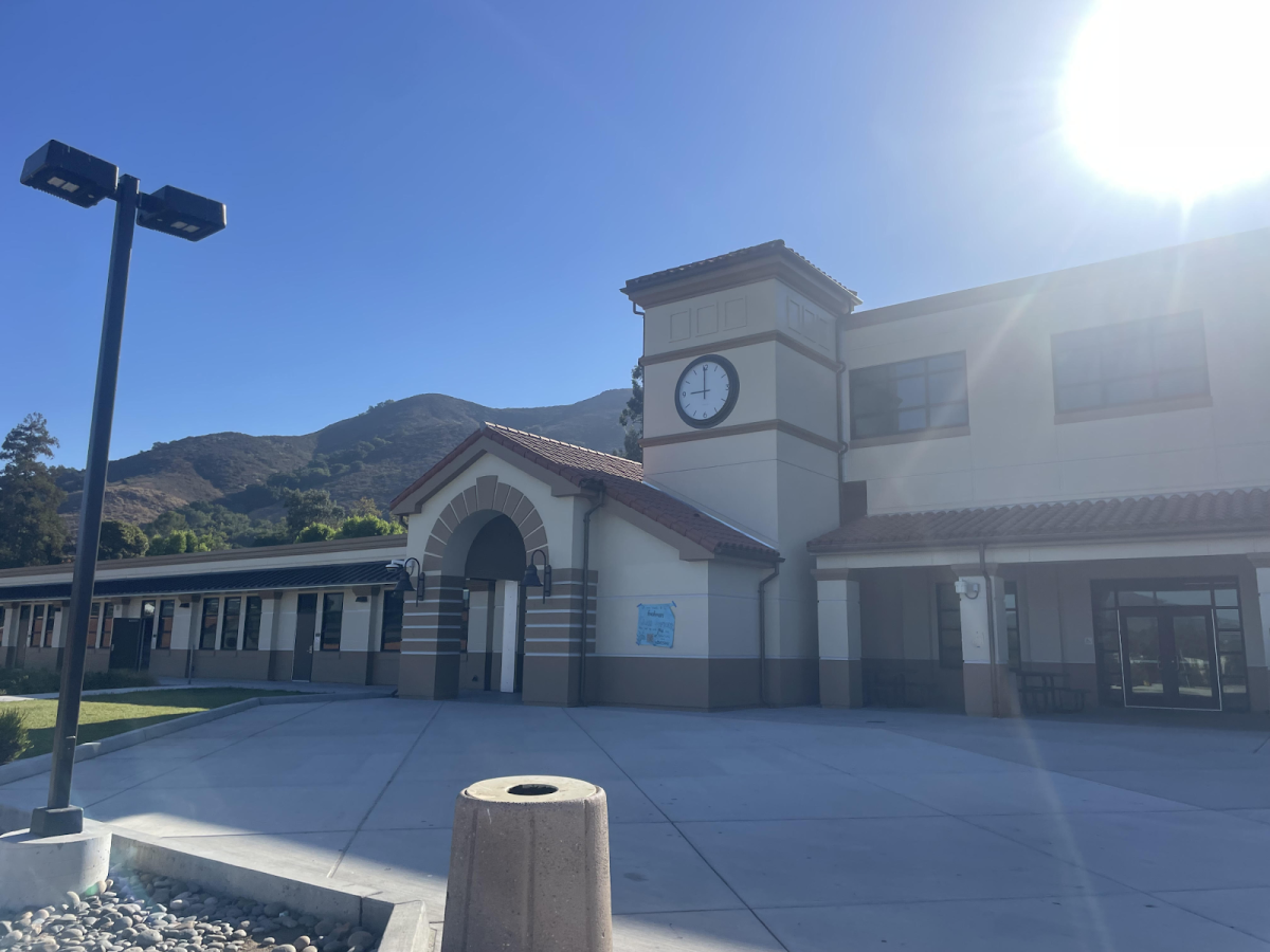
The entrance has a very clean and modern look yet includes little architectural details like the Roman arch!
SLOHS is the prettiest in spring when everything’s beautiful and green. Seeing this in person made me think of a Studio Ghibli film with all the plants.
The iconic middle trees that change leaf colors and mood with every season.
Green on green on green, the diverse range of trees are very beautiful.
Nature at SLOHS isn’t the only thing that’s a work of art, so are the iconic art pieces made by SLOHS students themselves.
The new extension of the library looks very sleek and fits coherently with the recent renovations around campus.
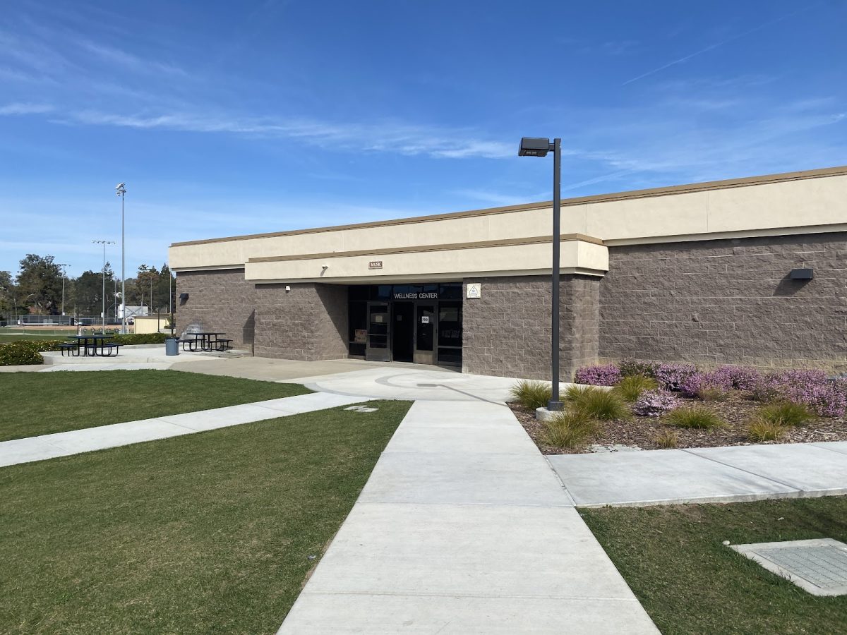
Another angle of the recent renovations around the commons. Everything is fitting into place and it looks like SLOHS might have their own architectural aesthetic with the beige walls, brown complementary colors, and natural color schemed roofs.
New stairs, new trees, new pathways, and the new cafeteria! So glad the class of 2024 could experience this before graduation.
The small gym always looks awesome with references to Roman architecture and detailed reliefs around the circle window.


